مرحبًا بك في قسم أعلى الخطوط — حيث تلتقي الشعبية بالجودة. هذه هي الخطوط الأكثر تنزيلًا واستخدامًا هذا العام من قبل مجتمعنا. إذا كنت بحاجة إلى اختيار موثوق للشعارات أو الويب أو وسائل التواصل، فابدأ من هنا.
يتميز كل خط رائج بتوازن جيد وقابلية قراءة وتعدد استخدامات. ستجد سان سيريف حديثة، وسكريبتات أنيقة، وسيريف كلاسيكية، وخطوط عرض minimal مختارة بعناية.
-
( Fonts by Televo - Personal-use only. For commercial use please contact owner. )
A modern, geometric font with bold, clean lines and a slightly condensed style.
 تنزيل 95 التنزيلات@WebFont
 -
( Fonts by Vultype - Candra Hamdani - Personal-use only. For commercial use please contact owner. )
A cursive, handwritten-style font with elegant loops and swashes.
![Quefira Regular تنزيل الخطوط]() تنزيل 95 التنزيلات@WebFont
تنزيل 95 التنزيلات@WebFont -
![Aldertonsage Regular تنزيل الخطوط]() تنزيل 95 التنزيلات@WebFont
تنزيل 95 التنزيلات@WebFont -
( Fonts by Typodermic Fonts )
A bold, italicized, and condensed font with high contrast, ideal for impactful headlines.
![KingsbridgeCdRg-BoldItalic تنزيل الخطوط]() تنزيل 95 التنزيلات@WebFont
تنزيل 95 التنزيلات@WebFont -
( Fonts by K_IN Studio - Personal-use only. For commercial use please contact owner. )
A clean, minimalist font with tall, narrow letterforms and consistent stroke thickness.
![STAYHOMERegular تنزيل الخطوط]() تنزيل 95 التنزيلات@WebFont
تنزيل 95 التنزيلات@WebFont -
-
( Fonts by Manfred Klein. Free for private and charity use. Free for commercial with donation to organizations )
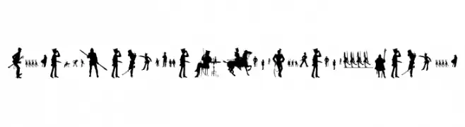
Silhouette-based font with historical figure illustrations forming each character.
![SteubenHelpsPresident تنزيل الخطوط]() تنزيل 95 التنزيلات@WebFont
تنزيل 95 التنزيلات@WebFont -
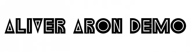
( Fonts by Noah Type )
A bold, geometric font with angular shapes and art deco influences.
![Aliver Aron Demo تنزيل الخطوط]() تنزيل 95 التنزيلات@WebFont
تنزيل 95 التنزيلات@WebFont -
( Fonts by Studio Hello Good )
A playful, bold font with rounded edges and a cartoonish style.
![DEL PIPPO تنزيل الخطوط]() تنزيل 95 التنزيلات@WebFont
تنزيل 95 التنزيلات@WebFont -
( Fonts by Mans Greback - Personal-use only. For commercial use please contact owner. )
A bold serif font with a classic yet modern appeal.
![Manofik PERSONAL USE ONLY Regular تنزيل الخطوط]() تنزيل 95 التنزيلات@WebFont
تنزيل 95 التنزيلات@WebFont -
( Fonts by a cenz qobbal - www.facebook.com/cenzqobbalfonts. Personal-use only. For commercial use please contact owner. )
A decorative, high-contrast font with elongated, narrow letterforms and sharp serifs.
![Bunga Cengkih Random تنزيل الخطوط]() تنزيل 95 التنزيلات@WebFont
تنزيل 95 التنزيلات@WebFont


ما هي أبرز الخطوط الآن؟
تحظى KHMenu Regular, Quefira Regular, Aldertonsage Regular, KingsbridgeCdRg-BoldItalic and STAYHOMERegular بشعبية لخطوطها النظيفة وتطبيقاتها الواسعة — من الهوية البصرية إلى الصفحات المقصودة والملصقات.
أي الخطوط تُستخدم كثيرًا في الشعارات؟
تُعد السان سيريف الهندسية (مثل Poppins وعائلات على نمط Gotham) خيارًا شائعًا لعلامات نظيفة قابلة للتوسع. ولإضفاء طابع ودي، تبقى السكريبت واليدوية خيارًا كلاسيكيًا. اجمع عنوانًا بارزًا مع خط نصي محايد لتحقيق التوازن والتميّز.
كم مرة يتم تحديث قائمة أعلى الخطوط؟
نحدّثها بانتظام استنادًا إلى التنزيلات والنشاط الفعلي. عُد إليها كثيرًا لاكتشاف النجوم الصاعدة مبكرًا.
💡 نصيحة: أضف هذه الصفحة إلى العلامات — تتغير الاتجاهات بسرعة وقد تُلهم خطوط اليوم الرائجة إعادة العلامة غدًا.