مرحبًا بك في قسم أعلى الخطوط — حيث تلتقي الشعبية بالجودة. هذه هي الخطوط الأكثر تنزيلًا واستخدامًا هذا العام من قبل مجتمعنا. إذا كنت بحاجة إلى اختيار موثوق للشعارات أو الويب أو وسائل التواصل، فابدأ من هنا.
يتميز كل خط رائج بتوازن جيد وقابلية قراءة وتعدد استخدامات. ستجد سان سيريف حديثة، وسكريبتات أنيقة، وسيريف كلاسيكية، وخطوط عرض minimal مختارة بعناية.
-
( Fonts by douglas vitkauskas - Personal-use only. For commercial use please contact owner. )
A tall, narrow font with a modern and striking appearance, featuring tight character spacing.
 تنزيل 93 التنزيلات@WebFont
 -
( Fonts by Daniel Zadorozny - www.iconian.com )
A bold, slanted, geometric font with a strong, impactful presence.
![Philadelphia Leftalic تنزيل الخطوط]() تنزيل 93 التنزيلات@WebFont
تنزيل 93 التنزيلات@WebFont -
( Fonts by Daniel Zadorozny - www.iconian.com - Personal-use only. For commercial use please contact owner. )
A bold, 3D italic font with outlined characters and a dynamic style.
![National Express 3D Italic تنزيل الخطوط]() تنزيل 93 التنزيلات@WebFont
تنزيل 93 التنزيلات@WebFont -
( Fonts by Daniel Gauthier )
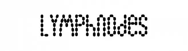
A playful, dot-based font with a modern, digital aesthetic.
![Lymphnodes تنزيل الخطوط]() تنزيل 93 التنزيلات@WebFont
تنزيل 93 التنزيلات@WebFont -
( Fonts by Mans Greback - Personal-use only. For commercial use please contact owner. )
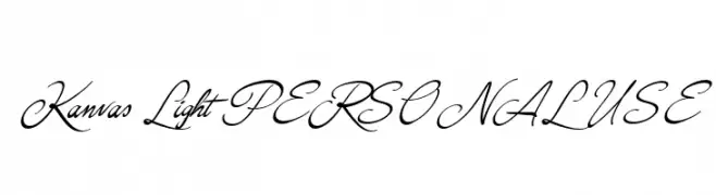
An elegant, flowing script font with ornate uppercase and cohesive lowercase letters.
![Kanvas Light PERSONAL USE تنزيل الخطوط]() تنزيل 93 التنزيلات@WebFont
تنزيل 93 التنزيلات@WebFont -
-
( Fonts by Masato Shimojima - Personal-use only. For commercial use please contact owner. )
A modern, narrow font with consistent stroke width and elegant design.
![Contactlight تنزيل الخطوط]() تنزيل 93 التنزيلات@WebFont
تنزيل 93 التنزيلات@WebFont -
![Gamestation-TextObliqOutline تنزيل الخطوط]() تنزيل 93 التنزيلات@WebFont
تنزيل 93 التنزيلات@WebFont -
![Texas Drop تنزيل الخطوط]() تنزيل 93 التنزيلات@WebFont
تنزيل 93 التنزيلات@WebFont -
( Fonts by NihStudio )
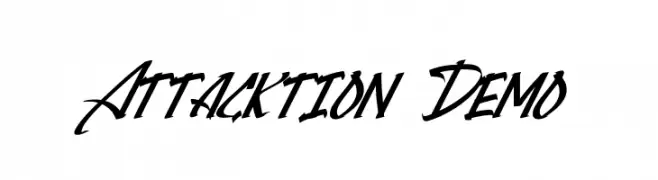
A dynamic and energetic script font with sharp, angular strokes.
![Attacktion Demo تنزيل الخطوط]() تنزيل 93 التنزيلات@WebFont
تنزيل 93 التنزيلات@WebFont -
( Fonts by Vladimir Nikolic )
A modern, connected hollow font with geometric shapes and consistent stroke width.
![Connected Hollow Regular تنزيل الخطوط]() تنزيل 93 التنزيلات@WebFont
تنزيل 93 التنزيلات@WebFont


ما هي أبرز الخطوط الآن؟
تحظى Vtks Azeitona, Philadelphia Leftalic, National Express 3D Italic, Lymphnodes and Kanvas Light PERSONAL USE بشعبية لخطوطها النظيفة وتطبيقاتها الواسعة — من الهوية البصرية إلى الصفحات المقصودة والملصقات.
أي الخطوط تُستخدم كثيرًا في الشعارات؟
تُعد السان سيريف الهندسية (مثل Poppins وعائلات على نمط Gotham) خيارًا شائعًا لعلامات نظيفة قابلة للتوسع. ولإضفاء طابع ودي، تبقى السكريبت واليدوية خيارًا كلاسيكيًا. اجمع عنوانًا بارزًا مع خط نصي محايد لتحقيق التوازن والتميّز.
كم مرة يتم تحديث قائمة أعلى الخطوط؟
نحدّثها بانتظام استنادًا إلى التنزيلات والنشاط الفعلي. عُد إليها كثيرًا لاكتشاف النجوم الصاعدة مبكرًا.
💡 نصيحة: أضف هذه الصفحة إلى العلامات — تتغير الاتجاهات بسرعة وقد تُلهم خطوط اليوم الرائجة إعادة العلامة غدًا.