مرحبًا بك في قسم أعلى الخطوط — حيث تلتقي الشعبية بالجودة. هذه هي الخطوط الأكثر تنزيلًا واستخدامًا هذا العام من قبل مجتمعنا. إذا كنت بحاجة إلى اختيار موثوق للشعارات أو الويب أو وسائل التواصل، فابدأ من هنا.
يتميز كل خط رائج بتوازن جيد وقابلية قراءة وتعدد استخدامات. ستجد سان سيريف حديثة، وسكريبتات أنيقة، وسيريف كلاسيكية، وخطوط عرض minimal مختارة بعناية.
-
( Fonts by Kats Fun Fonts. Personal-use only. For commercial use please contact owner. )
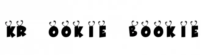
A bold, playful font with decorative antler-like elements on each letter.
 تنزيل 96 التنزيلات@WebFont
 -
( Fonts by www.houseoflime.com )
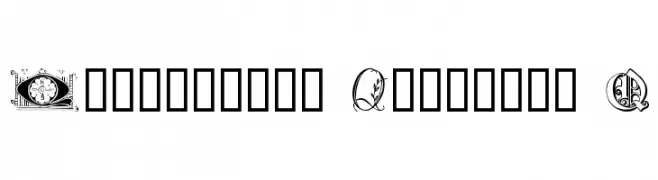
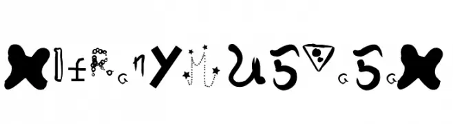
An ornate and decorative font featuring intricate designs around the letter 'Q'.
![Ornamental Initials Q تنزيل الخطوط]() تنزيل 96 التنزيلات@WebFont
تنزيل 96 التنزيلات@WebFont -
( Fonts by CannotIntoSpaceFonts - KineticPlasma Fonts - Personal-use only. For commercial use please contact owner. )
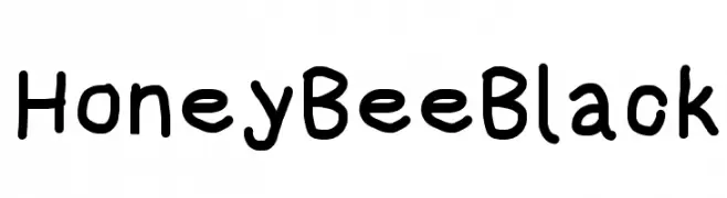
A bold, playful handwritten font with thick strokes and rounded edges.
![HoneyBee Black تنزيل الخطوط]() تنزيل 96 التنزيلات@WebFont
تنزيل 96 التنزيلات@WebFont -
( Fonts by Maulana Creative - Gilang Maulana - Personal-use only. For commercial use please contact owner. )
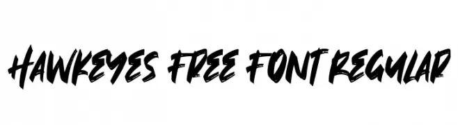
A bold, brush-style font with dynamic and expressive strokes.
![Hawkeyes Free Font Regular تنزيل الخطوط]() تنزيل 96 التنزيلات@WebFont
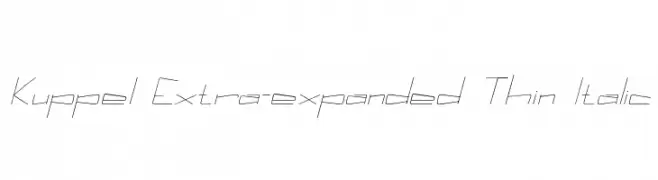
تنزيل 96 التنزيلات@WebFont -
![Kuppel Extra-expanded Thin Italic تنزيل الخطوط]() تنزيل 96 التنزيلات@WebFont
تنزيل 96 التنزيلات@WebFont -
-
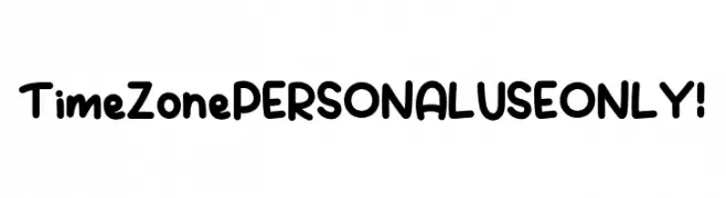
( Fonts by Kong Font )
A playful, bold font with rounded, thick strokes and a whimsical style.
![Time Zone PERSONAL USE ONLY! تنزيل الخطوط]() تنزيل 96 التنزيلات@WebFont
تنزيل 96 التنزيلات@WebFont -
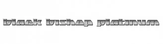
( Fonts by Daniel Zadorozny - www.iconian.com - Free for personal use )
A bold, geometric font with a distinctive horizontal striped pattern.
![Black Bishop Platinum تنزيل الخطوط]() تنزيل 96 التنزيلات@WebFont
تنزيل 96 التنزيلات@WebFont -
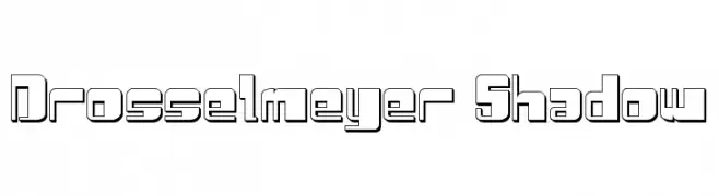
( Fonts by Daniel Zadorozny - www.iconian.com - Free for personal use )
A bold, geometric font with a shadow effect for a modern, three-dimensional look.
![Drosselmeyer Shadow تنزيل الخطوط]() تنزيل 96 التنزيلات@WebFont
تنزيل 96 التنزيلات@WebFont -
![Inter-Bureau Condensed Italic تنزيل الخطوط]() تنزيل 96 التنزيلات@WebFont
تنزيل 96 التنزيلات@WebFont -
خط بواسطة danny91194. For commercial use please contact the owner.
( w )
A whimsical and artistic decorative font with unique, abstract characters.
![HieronymusBosch تنزيل الخطوط]() تنزيل 96 التنزيلات@WebFont
تنزيل 96 التنزيلات@WebFont

ما هي أبرز الخطوط الآن؟
تحظى KR Ookie Bookie, Ornamental Initials Q, HoneyBee Black, Hawkeyes Free Font Regular and Kuppel Extra-expanded Thin Italic بشعبية لخطوطها النظيفة وتطبيقاتها الواسعة — من الهوية البصرية إلى الصفحات المقصودة والملصقات.
أي الخطوط تُستخدم كثيرًا في الشعارات؟
تُعد السان سيريف الهندسية (مثل Poppins وعائلات على نمط Gotham) خيارًا شائعًا لعلامات نظيفة قابلة للتوسع. ولإضفاء طابع ودي، تبقى السكريبت واليدوية خيارًا كلاسيكيًا. اجمع عنوانًا بارزًا مع خط نصي محايد لتحقيق التوازن والتميّز.
كم مرة يتم تحديث قائمة أعلى الخطوط؟
نحدّثها بانتظام استنادًا إلى التنزيلات والنشاط الفعلي. عُد إليها كثيرًا لاكتشاف النجوم الصاعدة مبكرًا.
💡 نصيحة: أضف هذه الصفحة إلى العلامات — تتغير الاتجاهات بسرعة وقد تُلهم خطوط اليوم الرائجة إعادة العلامة غدًا.