مرحبًا بك في قسم أعلى الخطوط — حيث تلتقي الشعبية بالجودة. هذه هي الخطوط الأكثر تنزيلًا واستخدامًا هذا العام من قبل مجتمعنا. إذا كنت بحاجة إلى اختيار موثوق للشعارات أو الويب أو وسائل التواصل، فابدأ من هنا.
يتميز كل خط رائج بتوازن جيد وقابلية قراءة وتعدد استخدامات. ستجد سان سيريف حديثة، وسكريبتات أنيقة، وسيريف كلاسيكية، وخطوط عرض minimal مختارة بعناية.
-
( Fonts by HyFont Studio )
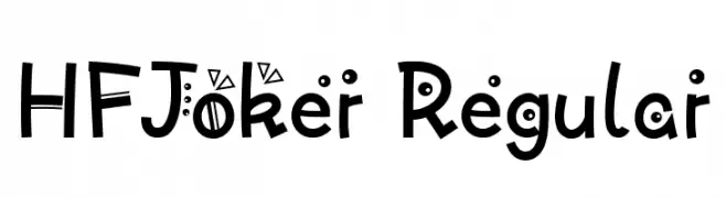
A playful and whimsical font with quirky embellishments and dynamic letterforms.
 تنزيل 96 التنزيلات@WebFont
 -
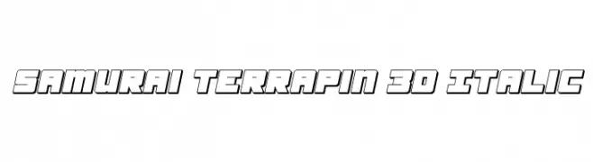
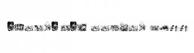
![Samurai Terrapin 3D Italic تنزيل الخطوط]() تنزيل 96 التنزيلات@WebFont
تنزيل 96 التنزيلات@WebFont -
( Fonts by Situjuh Nazara - 7ntypes.com - Personal-use only. For commercial use please contact owner. )
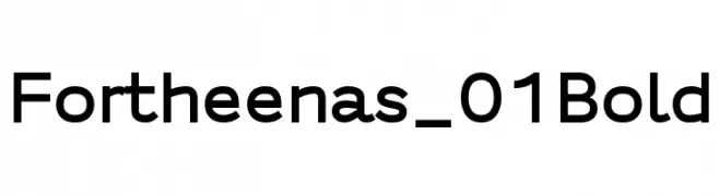
A bold, modern sans-serif font with clean lines and balanced spacing.
![Fortheenas_01 Bold تنزيل الخطوط]() تنزيل 96 التنزيلات@WebFont
تنزيل 96 التنزيلات@WebFont -
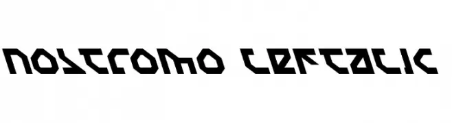
![Nostromo Leftalic تنزيل الخطوط]() تنزيل 96 التنزيلات@WebFont
تنزيل 96 التنزيلات@WebFont -
( Fonts by Xerographer Fonts )
A playful, brick-patterned decorative font with a hand-drawn feel.
![BrickRoads تنزيل الخطوط]() تنزيل 96 التنزيلات@WebFont
تنزيل 96 التنزيلات@WebFont -
-
( Fonts by bob istheowl http://luc.devroye.org/bobistheowl.html )
Illustrative, Victorian-inspired decorative font using detailed engravings for each character.
![Through the Looking Glass1 تنزيل الخطوط]() تنزيل 96 التنزيلات@WebFont
تنزيل 96 التنزيلات@WebFont -
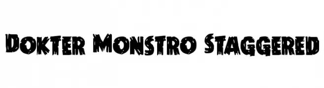
( Iconian Fonts - Daniel Zadorozny - www.iconian.com )
A bold, jagged font with a distressed, horror-themed design.
![Dokter Monstro Staggered تنزيل الخطوط]() تنزيل 96 التنزيلات@WebFont
تنزيل 96 التنزيلات@WebFont -
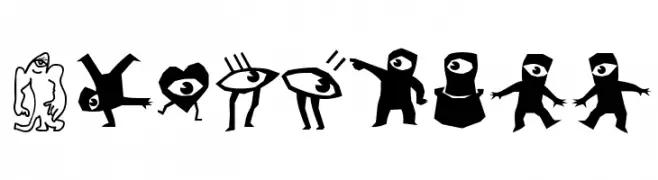
( Fonts by Manfred Klein. Free for private and charity use. Free for commercial with donation to organizations )
Whimsical dingbat font with cyclops and monster illustrations.
![Cyclopish تنزيل الخطوط]() تنزيل 96 التنزيلات@WebFont
تنزيل 96 التنزيلات@WebFont -
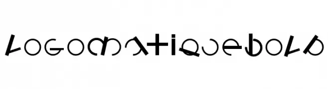
( Fonts by Manfred Klein. Free for private and charity use. Free for commercial with donation to organizations )
A bold, geometric font with modern and artistic elements.
![LogomatiqueBold تنزيل الخطوط]() تنزيل 96 التنزيلات@WebFont
تنزيل 96 التنزيلات@WebFont -
( Fonts by bob istheowl http://luc.devroye.org/bobistheowl.html )
A bold, impactful font with thick strokes and tight spacing, ideal for serious messages.
![BewarethefriendlystrangerLandscape تنزيل الخطوط]() تنزيل 96 التنزيلات@WebFont
تنزيل 96 التنزيلات@WebFont

ما هي أبرز الخطوط الآن؟
تحظى HFJoker Regular, Samurai Terrapin 3D Italic, Fortheenas_01 Bold, Nostromo Leftalic and BrickRoads بشعبية لخطوطها النظيفة وتطبيقاتها الواسعة — من الهوية البصرية إلى الصفحات المقصودة والملصقات.
أي الخطوط تُستخدم كثيرًا في الشعارات؟
تُعد السان سيريف الهندسية (مثل Poppins وعائلات على نمط Gotham) خيارًا شائعًا لعلامات نظيفة قابلة للتوسع. ولإضفاء طابع ودي، تبقى السكريبت واليدوية خيارًا كلاسيكيًا. اجمع عنوانًا بارزًا مع خط نصي محايد لتحقيق التوازن والتميّز.
كم مرة يتم تحديث قائمة أعلى الخطوط؟
نحدّثها بانتظام استنادًا إلى التنزيلات والنشاط الفعلي. عُد إليها كثيرًا لاكتشاف النجوم الصاعدة مبكرًا.
💡 نصيحة: أضف هذه الصفحة إلى العلامات — تتغير الاتجاهات بسرعة وقد تُلهم خطوط اليوم الرائجة إعادة العلامة غدًا.