مرحبًا بك في قسم أعلى الخطوط — حيث تلتقي الشعبية بالجودة. هذه هي الخطوط الأكثر تنزيلًا واستخدامًا هذا العام من قبل مجتمعنا. إذا كنت بحاجة إلى اختيار موثوق للشعارات أو الويب أو وسائل التواصل، فابدأ من هنا.
يتميز كل خط رائج بتوازن جيد وقابلية قراءة وتعدد استخدامات. ستجد سان سيريف حديثة، وسكريبتات أنيقة، وسيريف كلاسيكية، وخطوط عرض minimal مختارة بعناية.
-
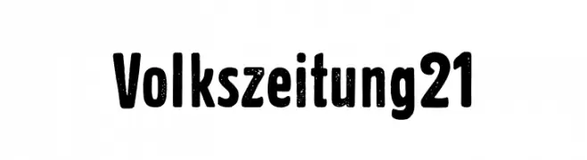
( Fonts by Lukas Krakora - Personal-use only. For commercial use please contact owner. )
A bold, distressed font with a vintage, textured appearance.
 تنزيل 96 التنزيلات@WebFont
 -
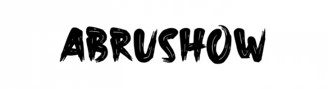
( Fonts by wep - Wahyu Eka Prasetya - Personal-use only. For commercial use please contact owner. )
A bold, brush-style font with dynamic and expressive strokes.
![Abrushow تنزيل الخطوط]() تنزيل 96 التنزيلات@WebFont
تنزيل 96 التنزيلات@WebFont -
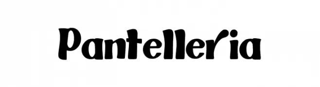
( Fonts by E.R.A type - Personal-use only. For commercial use please contact owner. )
A bold, playful font with thick, rounded strokes and a hand-drawn appearance.
![Pantelleria تنزيل الخطوط]() تنزيل 96 التنزيلات@WebFont
تنزيل 96 التنزيلات@WebFont -
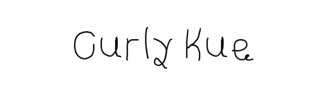
![Curly Kue تنزيل الخطوط]() تنزيل 96 التنزيلات@WebFont
تنزيل 96 التنزيلات@WebFont -
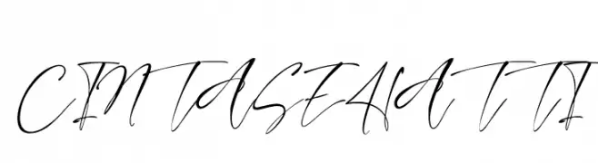
( Fonts by StringLabs Creative Studio )
A dynamic and elegant script font with fluid, sweeping strokes and a handwritten appearance.
![CINTA SEHATTI تنزيل الخطوط]() تنزيل 96 التنزيلات@WebFont
تنزيل 96 التنزيلات@WebFont -
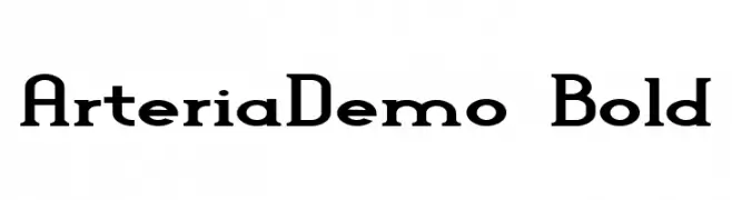
-
![Arteria-Demo Bold تنزيل الخطوط]() تنزيل 96 التنزيلات@WebFont
تنزيل 96 التنزيلات@WebFont -
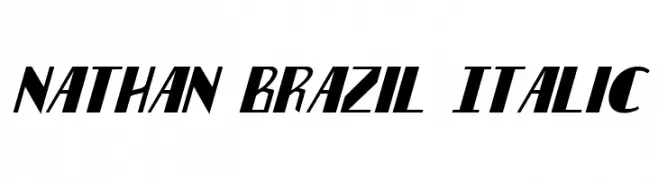
( Fonts by Daniel Zadorozny - www.iconian.com - Free for personal use )
A bold, italic font with sharp angles and a dynamic, modern style.
![Nathan Brazil Italic تنزيل الخطوط]() تنزيل 96 التنزيلات@WebFont
تنزيل 96 التنزيلات@WebFont -
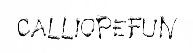
( Fonts by Peter Olexa - www.dealjumbo.com - Personal-use only. For commercial use please contact owner. )
A decorative, brush-like font with organic, fluid forms and a whimsical style.
![Calliopefun تنزيل الخطوط]() تنزيل 96 التنزيلات@WebFont
تنزيل 96 التنزيلات@WebFont -
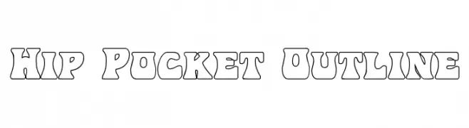
( Fonts by Daniel Zadorozny - www.iconian.com )
A bold, outlined font with a retro and playful style.
![Hip Pocket Outline تنزيل الخطوط]() تنزيل 96 التنزيلات@WebFont
تنزيل 96 التنزيلات@WebFont -
( Fonts by Manfred Klein. Free for private and charity use. Free for commercial with donation to organizations )
A playful dingbat font with angelic and festive illustrations.
![LosAngelesBatzz تنزيل الخطوط]() تنزيل 96 التنزيلات@WebFont
تنزيل 96 التنزيلات@WebFont

ما هي أبرز الخطوط الآن؟
تحظى Volkszeitung 21, Abrushow, Pantelleria, Curly Kue and CINTA SEHATTI بشعبية لخطوطها النظيفة وتطبيقاتها الواسعة — من الهوية البصرية إلى الصفحات المقصودة والملصقات.
أي الخطوط تُستخدم كثيرًا في الشعارات؟
تُعد السان سيريف الهندسية (مثل Poppins وعائلات على نمط Gotham) خيارًا شائعًا لعلامات نظيفة قابلة للتوسع. ولإضفاء طابع ودي، تبقى السكريبت واليدوية خيارًا كلاسيكيًا. اجمع عنوانًا بارزًا مع خط نصي محايد لتحقيق التوازن والتميّز.
كم مرة يتم تحديث قائمة أعلى الخطوط؟
نحدّثها بانتظام استنادًا إلى التنزيلات والنشاط الفعلي. عُد إليها كثيرًا لاكتشاف النجوم الصاعدة مبكرًا.
💡 نصيحة: أضف هذه الصفحة إلى العلامات — تتغير الاتجاهات بسرعة وقد تُلهم خطوط اليوم الرائجة إعادة العلامة غدًا.