مرحبًا بك في قسم أعلى الخطوط — حيث تلتقي الشعبية بالجودة. هذه هي الخطوط الأكثر تنزيلًا واستخدامًا هذا العام من قبل مجتمعنا. إذا كنت بحاجة إلى اختيار موثوق للشعارات أو الويب أو وسائل التواصل، فابدأ من هنا.
يتميز كل خط رائج بتوازن جيد وقابلية قراءة وتعدد استخدامات. ستجد سان سيريف حديثة، وسكريبتات أنيقة، وسيريف كلاسيكية، وخطوط عرض minimal مختارة بعناية.
-
 تنزيل 98 التنزيلات@WebFont
 -
( Fonts by Aboe Zart Studio )
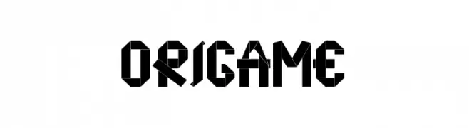
A bold, geometric font inspired by origami, featuring sharp angles and creative use of negative space.
![origame تنزيل الخطوط]() تنزيل 98 التنزيلات@WebFont
تنزيل 98 التنزيلات@WebFont -
( Fonts by Jovanny Lemonad - typetype.ru - Personal-use only. For commercial use please contact owner. )
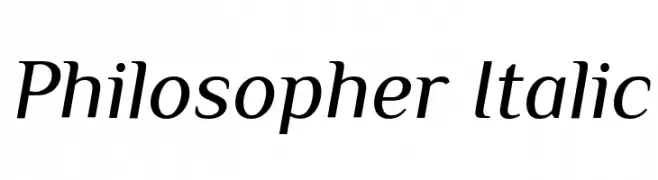
An elegant and refined italic font with smooth, flowing letterforms.
![Philosopher Italic تنزيل الخطوط]() تنزيل 98 التنزيلات@WebFont
تنزيل 98 التنزيلات@WebFont -
( Fonts by deFharo - Personal-use only. For commercial use please contact owner. )
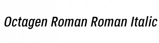
A modern, italicized font with clean lines and consistent stroke width.
![Octagen Roman Roman Italic تنزيل الخطوط]() تنزيل 98 التنزيلات@WebFont
تنزيل 98 التنزيلات@WebFont -
( Fonts by Manfred Klein. Free for private and charity use. Free for commercial with donation to organizations )
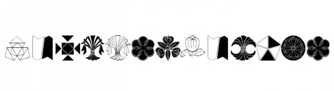
Ornamental symbol set with geometric and floral motifs.
![MonsTheFourth تنزيل الخطوط]() تنزيل 98 التنزيلات@WebFont
تنزيل 98 التنزيلات@WebFont -
-
( Fonts by www.typodermicfonts.com - Ray Larabie )
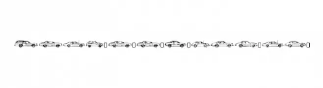
Automotive-themed decorative font with car and truck illustrations.
![OilCrisisB-Regular تنزيل الخطوط]() تنزيل 98 التنزيلات@WebFont
تنزيل 98 التنزيلات@WebFont -
( Fonts by Manfred Klein. Free for private and charity use. Free for commercial with donation to organizations )
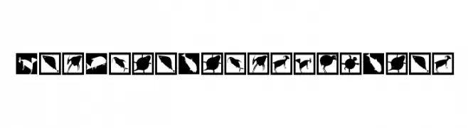
A collection of animal silhouettes and abstract patterns inspired by ancient cave drawings.
![NewCaveDrawingsDrei تنزيل الخطوط]() تنزيل 98 التنزيلات@WebFont
تنزيل 98 التنزيلات@WebFont -
( Fonts by Manfred Klein. Free for private and charity use. Free for commercial with donation to organizations )
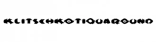
A bold, jagged font with a wild, torn-paper appearance.
![KlitschKOtiquaRound تنزيل الخطوط]() تنزيل 98 التنزيلات@WebFont
تنزيل 98 التنزيلات@WebFont -
( Fonts by Iconian Fonts )
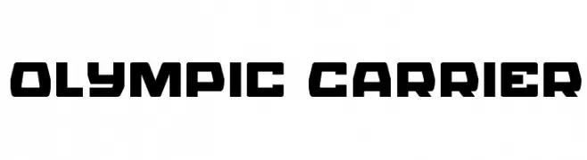
A bold, geometric font with a futuristic and industrial style.
![Olympic Carrier تنزيل الخطوط]() تنزيل 97 التنزيلات@WebFont
تنزيل 97 التنزيلات@WebFont -
( Jessica Darnell )
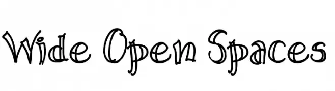
A playful, hand-drawn font with bold, whimsical strokes.
![Wide Open Spaces تنزيل الخطوط]() تنزيل 97 التنزيلات@WebFont
تنزيل 97 التنزيلات@WebFont
ما هي أبرز الخطوط الآن؟
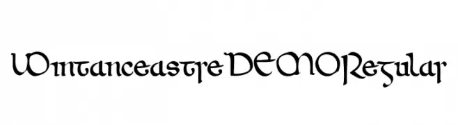
تحظى Wintanceastre DEMO Regular, origame, Philosopher Italic, Octagen Roman Roman Italic and MonsTheFourth بشعبية لخطوطها النظيفة وتطبيقاتها الواسعة — من الهوية البصرية إلى الصفحات المقصودة والملصقات.
أي الخطوط تُستخدم كثيرًا في الشعارات؟
تُعد السان سيريف الهندسية (مثل Poppins وعائلات على نمط Gotham) خيارًا شائعًا لعلامات نظيفة قابلة للتوسع. ولإضفاء طابع ودي، تبقى السكريبت واليدوية خيارًا كلاسيكيًا. اجمع عنوانًا بارزًا مع خط نصي محايد لتحقيق التوازن والتميّز.
كم مرة يتم تحديث قائمة أعلى الخطوط؟
نحدّثها بانتظام استنادًا إلى التنزيلات والنشاط الفعلي. عُد إليها كثيرًا لاكتشاف النجوم الصاعدة مبكرًا.
💡 نصيحة: أضف هذه الصفحة إلى العلامات — تتغير الاتجاهات بسرعة وقد تُلهم خطوط اليوم الرائجة إعادة العلامة غدًا.