مرحبًا بك في قسم أعلى الخطوط — حيث تلتقي الشعبية بالجودة. هذه هي الخطوط الأكثر تنزيلًا واستخدامًا هذا العام من قبل مجتمعنا. إذا كنت بحاجة إلى اختيار موثوق للشعارات أو الويب أو وسائل التواصل، فابدأ من هنا.
يتميز كل خط رائج بتوازن جيد وقابلية قراءة وتعدد استخدامات. ستجد سان سيريف حديثة، وسكريبتات أنيقة، وسيريف كلاسيكية، وخطوط عرض minimal مختارة بعناية.
-
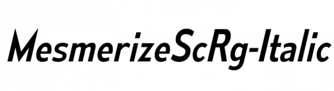
( Typodermic Fonts - Ray Larabie - www.typodermicfonts.com/ )
A sleek, modern italic font with consistent stroke width and elegant design.
 تنزيل 98 التنزيلات@WebFont
 -
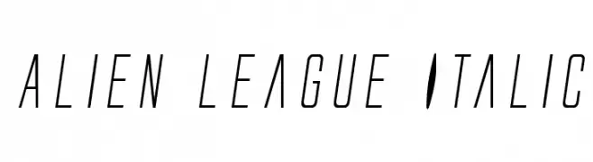
( Fonts by Daniel Zadorozny - www.iconian.com )
A sleek, futuristic italic font with elongated, narrow characters.
![Alien League Italic تنزيل الخطوط]() تنزيل 98 التنزيلات@WebFont
تنزيل 98 التنزيلات@WebFont -
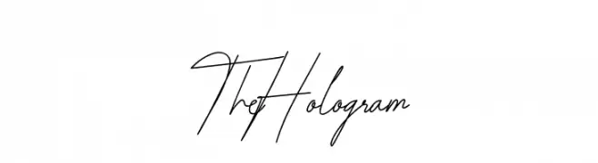
( Fonts by Behind the Ink )
A fluid and elegant script font with a handwritten quality.
![The Hologram تنزيل الخطوط]() تنزيل 98 التنزيلات@WebFont
تنزيل 98 التنزيلات@WebFont -
![SKSunset تنزيل الخطوط]() تنزيل 98 التنزيلات@WebFont
تنزيل 98 التنزيلات@WebFont -
( Iconian Fonts - Daniel Zadorozny - www.iconian.com )
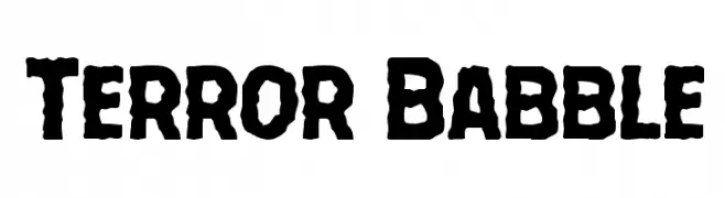
A bold, rugged font with a distressed, hand-drawn appearance, perfect for dramatic themes.
![Terror Babble تنزيل الخطوط]() تنزيل 98 التنزيلات@WebFont
تنزيل 98 التنزيلات@WebFont -
-
( Fonts by Manfred Klein. Free for private and charity use. Free for commercial with donation to organizations )
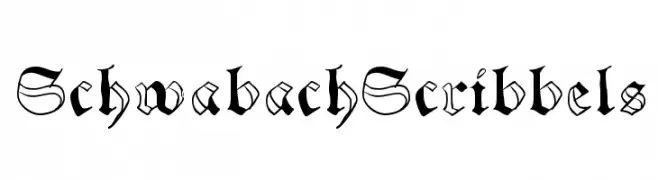
A traditional blackletter font with ornate, angular letterforms.
![SchwabachScribbels تنزيل الخطوط]() تنزيل 98 التنزيلات@WebFont
تنزيل 98 التنزيلات@WebFont -
( Fonts by www.omniglot.com )
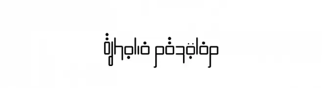
A futuristic, geometric font with sharp angles and circular elements.
![Efkolia Regular تنزيل الخطوط]() تنزيل 98 التنزيلات@WebFont
تنزيل 98 التنزيلات@WebFont -
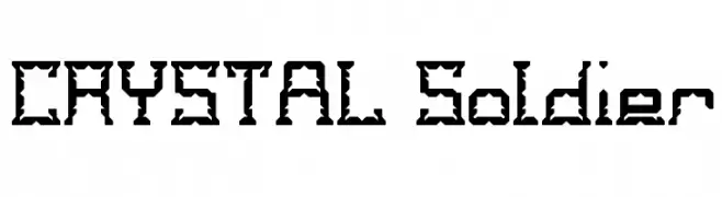
![CRYSTAL Soldier تنزيل الخطوط]() تنزيل 98 التنزيلات@WebFont
تنزيل 98 التنزيلات@WebFont -
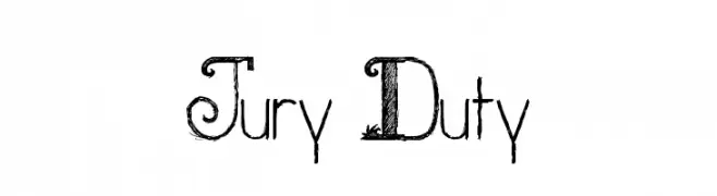
![Jury Duty تنزيل الخطوط]() تنزيل 98 التنزيلات@WebFont
تنزيل 98 التنزيلات@WebFont -
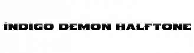
( Fonts by Iconian Fonts )
A bold, halftone-effect font with a modern, textured appearance.
![Indigo Demon Halftone تنزيل الخطوط]() تنزيل 98 التنزيلات@WebFont
تنزيل 98 التنزيلات@WebFont
ما هي أبرز الخطوط الآن؟
تحظى MesmerizeScRg-Italic, Alien League Italic, The Hologram, SKSunset and Terror Babble بشعبية لخطوطها النظيفة وتطبيقاتها الواسعة — من الهوية البصرية إلى الصفحات المقصودة والملصقات.
أي الخطوط تُستخدم كثيرًا في الشعارات؟
تُعد السان سيريف الهندسية (مثل Poppins وعائلات على نمط Gotham) خيارًا شائعًا لعلامات نظيفة قابلة للتوسع. ولإضفاء طابع ودي، تبقى السكريبت واليدوية خيارًا كلاسيكيًا. اجمع عنوانًا بارزًا مع خط نصي محايد لتحقيق التوازن والتميّز.
كم مرة يتم تحديث قائمة أعلى الخطوط؟
نحدّثها بانتظام استنادًا إلى التنزيلات والنشاط الفعلي. عُد إليها كثيرًا لاكتشاف النجوم الصاعدة مبكرًا.
💡 نصيحة: أضف هذه الصفحة إلى العلامات — تتغير الاتجاهات بسرعة وقد تُلهم خطوط اليوم الرائجة إعادة العلامة غدًا.