مرحبًا بك في قسم أعلى الخطوط — حيث تلتقي الشعبية بالجودة. هذه هي الخطوط الأكثر تنزيلًا واستخدامًا هذا العام من قبل مجتمعنا. إذا كنت بحاجة إلى اختيار موثوق للشعارات أو الويب أو وسائل التواصل، فابدأ من هنا.
يتميز كل خط رائج بتوازن جيد وقابلية قراءة وتعدد استخدامات. ستجد سان سيريف حديثة، وسكريبتات أنيقة، وسيريف كلاسيكية، وخطوط عرض minimal مختارة بعناية.
-
( Fonts by Woodcutter )
A bold, decorative font with a unique zigzag pattern and thick strokes.
 تنزيل 98 التنزيلات@WebFont
 -
( Fonts by Situjuh Nazara - 7ntypes.com - Personal-use only. For commercial use please contact owner. )
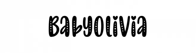
A playful, bold font with dotted patterns inside rounded characters.
![Baby Olivia تنزيل الخطوط]() تنزيل 98 التنزيلات@WebFont
تنزيل 98 التنزيلات@WebFont -
( Fonts by Peter Wiegel - www.peter-wiegel.de - Personal-use only. For commercial use please contact owner. )
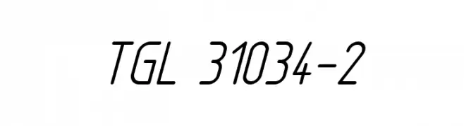
A sleek, modern font with a slight italic slant and consistent thin strokes.
![TGL 31034-2 تنزيل الخطوط]() تنزيل 98 التنزيلات@WebFont
تنزيل 98 التنزيلات@WebFont -
( Iconian Fonts - Daniel Zadorozny - www.iconian.com )
A bold, playful, and condensed font with a twisted, dynamic style.
![Mister Twisted Condensed تنزيل الخطوط]() تنزيل 98 التنزيلات@WebFont
تنزيل 98 التنزيلات@WebFont -
( Dry Heaves - www.drybohnz.com/ )
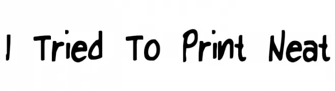
A playful, handwritten font with bold, uneven strokes and a whimsical feel.
![I Tried To Print Neat تنزيل الخطوط]() تنزيل 98 التنزيلات@WebFont
تنزيل 98 التنزيلات@WebFont -
-
( Fonts by feorag - Personal-use only. For commercial use please contact owner. )
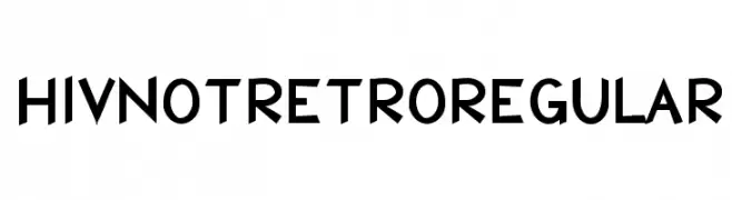
A bold, angular font with a modern and edgy style.
![HIVNotRetro Regular تنزيل الخطوط]() تنزيل 98 التنزيلات@WebFont
تنزيل 98 التنزيلات@WebFont -
( Fonts by Chris Vile )
A playful, handwritten italic font with bold strokes and a lively style.
![UglyKids-Italic تنزيل الخطوط]() تنزيل 98 التنزيلات@WebFont
تنزيل 98 التنزيلات@WebFont -
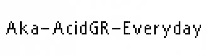
( Fonts by www.aka-acid.com )
A pixelated, retro-style font with a blocky, grid-based design.
![Aka-AcidGR-Everyday تنزيل الخطوط]() تنزيل 98 التنزيلات@WebFont
تنزيل 98 التنزيلات@WebFont -
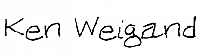
![Ken Weigand تنزيل الخطوط]() تنزيل 98 التنزيلات@WebFont
تنزيل 98 التنزيلات@WebFont -
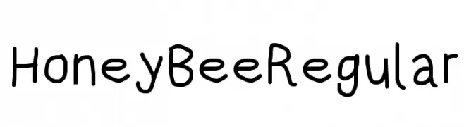
( Fonts by CannotIntoSpaceFonts - KineticPlasma Fonts - Personal-use only. For commercial use please contact owner. )
A playful, handwritten font with a casual and friendly appearance.
![HoneyBee Regular تنزيل الخطوط]() تنزيل 98 التنزيلات@WebFont
تنزيل 98 التنزيلات@WebFont


ما هي أبرز الخطوط الآن؟
تحظى Tkachenko, Baby Olivia, TGL 31034-2, Mister Twisted Condensed and I Tried To Print Neat بشعبية لخطوطها النظيفة وتطبيقاتها الواسعة — من الهوية البصرية إلى الصفحات المقصودة والملصقات.
أي الخطوط تُستخدم كثيرًا في الشعارات؟
تُعد السان سيريف الهندسية (مثل Poppins وعائلات على نمط Gotham) خيارًا شائعًا لعلامات نظيفة قابلة للتوسع. ولإضفاء طابع ودي، تبقى السكريبت واليدوية خيارًا كلاسيكيًا. اجمع عنوانًا بارزًا مع خط نصي محايد لتحقيق التوازن والتميّز.
كم مرة يتم تحديث قائمة أعلى الخطوط؟
نحدّثها بانتظام استنادًا إلى التنزيلات والنشاط الفعلي. عُد إليها كثيرًا لاكتشاف النجوم الصاعدة مبكرًا.
💡 نصيحة: أضف هذه الصفحة إلى العلامات — تتغير الاتجاهات بسرعة وقد تُلهم خطوط اليوم الرائجة إعادة العلامة غدًا.