مرحبًا بك في قسم أعلى الخطوط — حيث تلتقي الشعبية بالجودة. هذه هي الخطوط الأكثر تنزيلًا واستخدامًا هذا العام من قبل مجتمعنا. إذا كنت بحاجة إلى اختيار موثوق للشعارات أو الويب أو وسائل التواصل، فابدأ من هنا.
يتميز كل خط رائج بتوازن جيد وقابلية قراءة وتعدد استخدامات. ستجد سان سيريف حديثة، وسكريبتات أنيقة، وسيريف كلاسيكية، وخطوط عرض minimal مختارة بعناية.
-
( Fonts by CalligraphyFonts - Personal-use only. For commercial use please contact owner. )
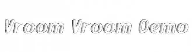
A bold, slanted font with diagonal line patterns, exuding energy and motion.
 تنزيل 100 التنزيلات@WebFont
 -
( Fonts by Manfred Klein. Free for private and charity use. Free for commercial with donation to organizations )
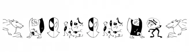
A quirky, illustrative dingbat font featuring abstract cartoon figures.
![DuererUnd تنزيل الخطوط]() تنزيل 100 التنزيلات@WebFont
تنزيل 100 التنزيلات@WebFont -
( Fonts by Chris Vile )
A bold, distressed font with a grunge and rebellious style.
![Our Retaliation تنزيل الخطوط]() تنزيل 100 التنزيلات@WebFont
تنزيل 100 التنزيلات@WebFont -
( Fonts by www.iconian.com - Personal-use only. For commercial use please contact owner. )
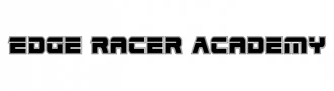
A bold, futuristic font with geometric and three-dimensional characteristics.
![Edge Racer Academy تنزيل الخطوط]() تنزيل 100 التنزيلات@WebFont
تنزيل 100 التنزيلات@WebFont -
( Fonts by Khurasan )
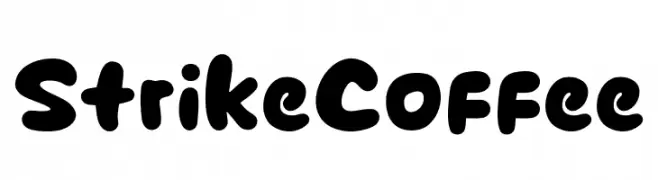
A bold, playful font with rounded edges and a hand-drawn feel.
![Strike Coffee تنزيل الخطوط]() تنزيل 100 التنزيلات@WebFont
تنزيل 100 التنزيلات@WebFont -
-
( Fonts by Jeff Levine. FREEWARE )
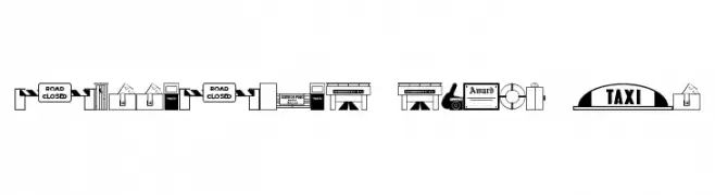
A collection of bold, graphic dingbat icons depicting urban and industrial elements.
![Collected Dings JL تنزيل الخطوط]() تنزيل 100 التنزيلات@WebFont
تنزيل 100 التنزيلات@WebFont -
( Syahputra - creativemarket.com/Bexxtype )
An elegant, flowing script font with a cursive, handwritten style.
![SakiraScript تنزيل الخطوط]() تنزيل 100 التنزيلات@WebFont
تنزيل 100 التنزيلات@WebFont -
( Fonts by Daniel Zadorozny - www.iconian.com - Free for personal use )
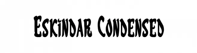
A bold, condensed font with a playful and whimsical style.
![Eskindar Condensed تنزيل الخطوط]() تنزيل 100 التنزيلات@WebFont
تنزيل 100 التنزيلات@WebFont -
( Fonts by www.gliphmaker.com. Personal-use only. For commercial use please contact owner. )
A bold, Art Deco-inspired font with geometric shapes and sharp angles.
![Prospect-Deco تنزيل الخطوط]() تنزيل 100 التنزيلات@WebFont
تنزيل 100 التنزيلات@WebFont -
( Abelardo Gonzalez - abbiecod.es )
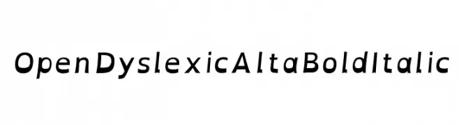
A bold, italic font designed for improved readability, especially for dyslexic readers.
![OpenDyslexicAlta Bold Italic تنزيل الخطوط]() تنزيل 100 التنزيلات@WebFont
تنزيل 100 التنزيلات@WebFont


ما هي أبرز الخطوط الآن؟
تحظى Vroom Vroom Demo, DuererUnd, Our Retaliation, Edge Racer Academy and Strike Coffee بشعبية لخطوطها النظيفة وتطبيقاتها الواسعة — من الهوية البصرية إلى الصفحات المقصودة والملصقات.
أي الخطوط تُستخدم كثيرًا في الشعارات؟
تُعد السان سيريف الهندسية (مثل Poppins وعائلات على نمط Gotham) خيارًا شائعًا لعلامات نظيفة قابلة للتوسع. ولإضفاء طابع ودي، تبقى السكريبت واليدوية خيارًا كلاسيكيًا. اجمع عنوانًا بارزًا مع خط نصي محايد لتحقيق التوازن والتميّز.
كم مرة يتم تحديث قائمة أعلى الخطوط؟
نحدّثها بانتظام استنادًا إلى التنزيلات والنشاط الفعلي. عُد إليها كثيرًا لاكتشاف النجوم الصاعدة مبكرًا.
💡 نصيحة: أضف هذه الصفحة إلى العلامات — تتغير الاتجاهات بسرعة وقد تُلهم خطوط اليوم الرائجة إعادة العلامة غدًا.