مرحبًا بك في قسم أعلى الخطوط — حيث تلتقي الشعبية بالجودة. هذه هي الخطوط الأكثر تنزيلًا واستخدامًا هذا العام من قبل مجتمعنا. إذا كنت بحاجة إلى اختيار موثوق للشعارات أو الويب أو وسائل التواصل، فابدأ من هنا.
يتميز كل خط رائج بتوازن جيد وقابلية قراءة وتعدد استخدامات. ستجد سان سيريف حديثة، وسكريبتات أنيقة، وسيريف كلاسيكية، وخطوط عرض minimal مختارة بعناية.
-
( Copyright (c) 2010, Santiago Orozco (hi@typemade.mx) )
A modern, geometric sans-serif font with a touch of vintage elegance.
 تنزيل 14615 التنزيلات@WebFont
 -
![Bambino تنزيل الخطوط]() تنزيل 14600 التنزيلات@WebFont
تنزيل 14600 التنزيلات@WebFont -
( Fonts by Castcraft Software - opti.netii.net - check the website before use )
A bold, impactful typeface with strong, thick strokes and rounded edges.
![OPTIAlpine-Bold تنزيل الخطوط]() تنزيل 14580 التنزيلات@WebFont
تنزيل 14580 التنزيلات@WebFont -
( Fonts by Manfred Klein - manfred-klein.ina-mar.com )
A bold slab serif font with rounded edges and strong visual impact.
![RoundslabSerif تنزيل الخطوط]() تنزيل 14576 التنزيلات@WebFont
تنزيل 14576 التنزيلات@WebFont -
( Google Web Fonts )
A bold, italicized font with strong, impactful strokes for modern designs.
![Open Sans Extrabold Italic تنزيل الخطوط]() تنزيل 14575 التنزيلات@WebFont
تنزيل 14575 التنزيلات@WebFont -
-
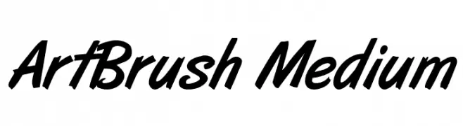
( Font by Gary D. Jessey )
A bold, brush-style font with dynamic, hand-painted strokes.
![ArtBrush Medium تنزيل الخطوط]() تنزيل 14570 التنزيلات
تنزيل 14570 التنزيلات -
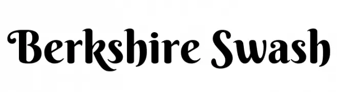
( Copyright (c) 2012 by Brian J. Bonislawsky DBA Astigmatic (AOETI) (astigma@astigmatic.com), with Reserved Font Names "Berkshire Swash" )
A playful and elegant swash-style font with bold, slightly condensed characters.
![Berkshire Swash تنزيل الخطوط]() تنزيل 14550 التنزيلات@WebFont
تنزيل 14550 التنزيلات@WebFont -
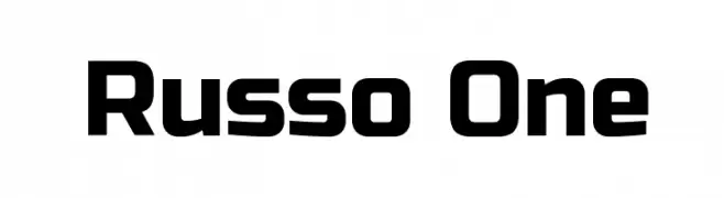
( Copyright (c) 2011-2012, Jovanny Lemonad (jovanny.ru), with Reserved Font Name "Russo" )
A bold, modern font with geometric structure and uniform stroke width.
![Russo One تنزيل الخطوط]() تنزيل 14549 التنزيلات@WebFont
تنزيل 14549 التنزيلات@WebFont -
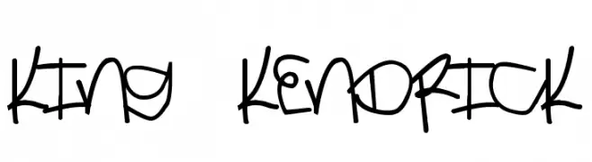
( Fonts by Thomas Weigl )
A bold, graffiti-inspired handwritten font with a dynamic and urban style.
![King Kendrick تنزيل الخطوط]() تنزيل 14534 التنزيلات@WebFont
تنزيل 14534 التنزيلات@WebFont -
( Fonts by Christine Mauerkirchner and Rainer Grunert - PrimaFont )
An elegant script font with flowing, cursive letterforms and high contrast.
![Exmouth تنزيل الخطوط]() تنزيل 14534 التنزيلات@WebFont
تنزيل 14534 التنزيلات@WebFont


ما هي أبرز الخطوط الآن؟
تحظى Josefin Sans Regular, Bambino, OPTIAlpine-Bold, RoundslabSerif and Open Sans Extrabold Italic بشعبية لخطوطها النظيفة وتطبيقاتها الواسعة — من الهوية البصرية إلى الصفحات المقصودة والملصقات.
أي الخطوط تُستخدم كثيرًا في الشعارات؟
تُعد السان سيريف الهندسية (مثل Poppins وعائلات على نمط Gotham) خيارًا شائعًا لعلامات نظيفة قابلة للتوسع. ولإضفاء طابع ودي، تبقى السكريبت واليدوية خيارًا كلاسيكيًا. اجمع عنوانًا بارزًا مع خط نصي محايد لتحقيق التوازن والتميّز.
كم مرة يتم تحديث قائمة أعلى الخطوط؟
نحدّثها بانتظام استنادًا إلى التنزيلات والنشاط الفعلي. عُد إليها كثيرًا لاكتشاف النجوم الصاعدة مبكرًا.
💡 نصيحة: أضف هذه الصفحة إلى العلامات — تتغير الاتجاهات بسرعة وقد تُلهم خطوط اليوم الرائجة إعادة العلامة غدًا.