مرحبًا بك في قسم الخطوط الجديدة — موجز مُنظّم لأحدث الخطوط المضافة إلى FFonts.net. إذا كنت مصممًا أو مطورًا أو شغوفًا بالطباعة، فسيساعدك هذا القسم على متابعة أحدث الاتجاهات.
يتمتع كل خط جديد بطابع خاص — من سان سيريف الحديثة النظيفة إلى السكريبتات المعبرة وخطوط العرض الجريئة. نُحدّث هذه القائمة باستمرار لتتمكّن من المعاينة المباشرة ثم تنزيل الخطوط مجانًا فور توفرها.
-
( Fonts by Google )
A modern, sans-serif typeface with condensed, semi-bold letterforms.
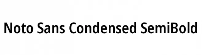 تنزيل 89 التنزيلات@WebFont
 -
( Fonts by Google )
A modern, extra condensed sans-serif font with medium weight and high legibility.
![Noto Sans ExtraCondensed Medium تنزيل الخطوط]() تنزيل 225 التنزيلات@WebFont
تنزيل 225 التنزيلات@WebFont -
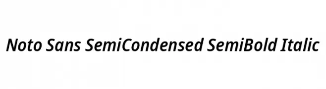
( Fonts by Google )
A modern, semi-condensed sans-serif font with semi-bold italic styling.
![Noto Sans SemiCondensed SemiBold Italic تنزيل الخطوط]() تنزيل 83 التنزيلات@WebFont
تنزيل 83 التنزيلات@WebFont -
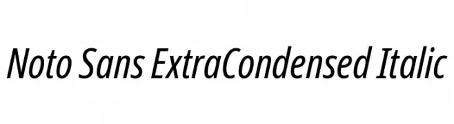
( Fonts by Google )
A sleek, modern sans-serif font with an extra condensed and italicized style.
![Noto Sans ExtraCondensed Italic تنزيل الخطوط]() تنزيل 119 التنزيلات@WebFont
تنزيل 119 التنزيلات@WebFont -
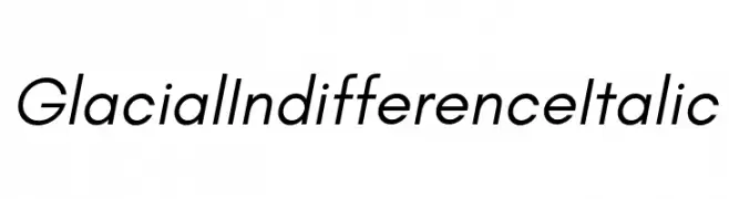
( Fonts by Hanken Design Co. )
A modern, italic sans-serif font with clean lines and balanced proportions.
![Glacial Indifference Italic تنزيل الخطوط]() تنزيل 5060 التنزيلات@WebFont
تنزيل 5060 التنزيلات@WebFont -
-
( Fonts by Hanken Design Co. )
A clean, modern sans-serif font with geometric shapes and even stroke widths.
![Glacial Indifference Regular تنزيل الخطوط]() تنزيل 456 التنزيلات@WebFont
تنزيل 456 التنزيلات@WebFont -
( Fonts by Christian Robertson )
A bold, modern sans-serif typeface with a clean and impactful design.
![Roboto Black تنزيل الخطوط]() تنزيل 480 التنزيلات@WebFont
تنزيل 480 التنزيلات@WebFont -
( Fonts by Donald E. Knuth )
A semi-bold, oblique font with moderate contrast and normal spacing.
![CMU Bright SemiBoldOblique تنزيل الخطوط]() تنزيل 188 التنزيلات@WebFont
تنزيل 188 التنزيلات@WebFont -
( Fonts by M+ Fonts )
A modern, thin-stroked font with a clean and elegant appearance.
![M+ 1c thin تنزيل الخطوط]() تنزيل 113 التنزيلات@WebFont
تنزيل 113 التنزيلات@WebFont -
( Fonts by Jacques Le Bailly )
A bold, italicized modern font with smooth, consistent strokes.
![Nunito Sans Black Italic تنزيل الخطوط]() تنزيل 248 التنزيلات@WebFont
تنزيل 248 التنزيلات@WebFont


الأسئلة الشائعة — الخطوط الجديدة
ما الخط الجديد الذي يستخدمه الجميع الآن؟
تتغير الشعبية بسرعة، لكن خطوط السان سيريف البسيطة وخطوط العرض المعبّرة تتصدر حاليًا — خاصةً لمحتوى الهواتف المحمولة والهوية الحديثة.
ما هي خمسة خطوط جديدة بارزة؟
من المفضلات مؤخرًا Noto Sans Condensed SemiBold, Noto Sans ExtraCondensed Medium, Noto Sans SemiCondensed SemiBold Italic, Noto Sans ExtraCondensed Italic and Glacial Indifference Italic. توازن هذه الخطوط بين الوضوح والشخصية وتناسب العلامات التقنية، وتصاميم التحرير، ومرئيات الشبكات الاجتماعية.
كيف أجرّب الخط قبل تنزيله؟
استخدم المعاينة المباشرة: اكتب نصك على صفحة الخط لاختبار الوزن والمسافات وقابلية القراءة عبر أحجام مختلفة. بعد أن يناسبك الشكل، نزّل ملفات TTF/OTF.